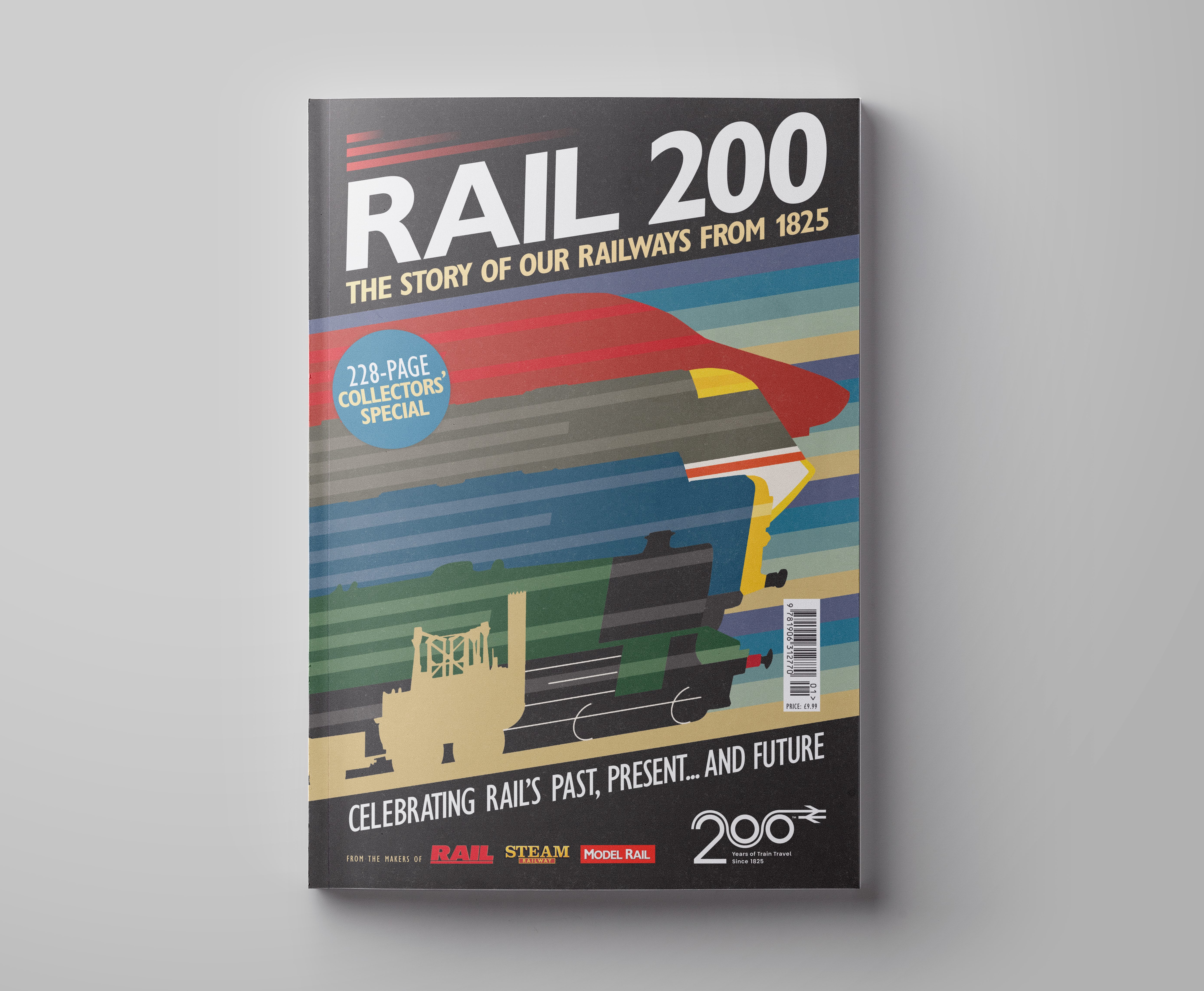
Created for RAIL 200, a 228-page bookazine celebrating 200 years of British railways, this cover needed to stand out in a crowded commemorative market. The brief required a single visual that could reflect 200 years of rail history — from the Industrial Revolution to the present day — without becoming overly detailed or retrospective.
I took inspiration from classic Art Deco railway posters, known for their bold shapes and romanticised sense of travel. Using Adobe Illustrator, I developed a layered silhouette illustration that blends steam, diesel, and modern trains into one continuous, flowing form. The coloured horizontal lines add energy and movement, symbolising progress and momentum across the eras.
The design balances heritage and modernity, offering a fresh take on a familiar subject — striking enough for collectors, but clear and contemporary enough to catch attention on the shelf.
A selection of my logo design work encompassing both ongoing franchise branding and special anniversary commemorations. These designs demonstrate my ability to translate editorial themes into impactful visual assets that resonate with a dedicated readership.
A special collection of postcards, created as cover gifts for Steam Railway readers across several issues, with each design showcasing and celebrating iconic railway artwork.
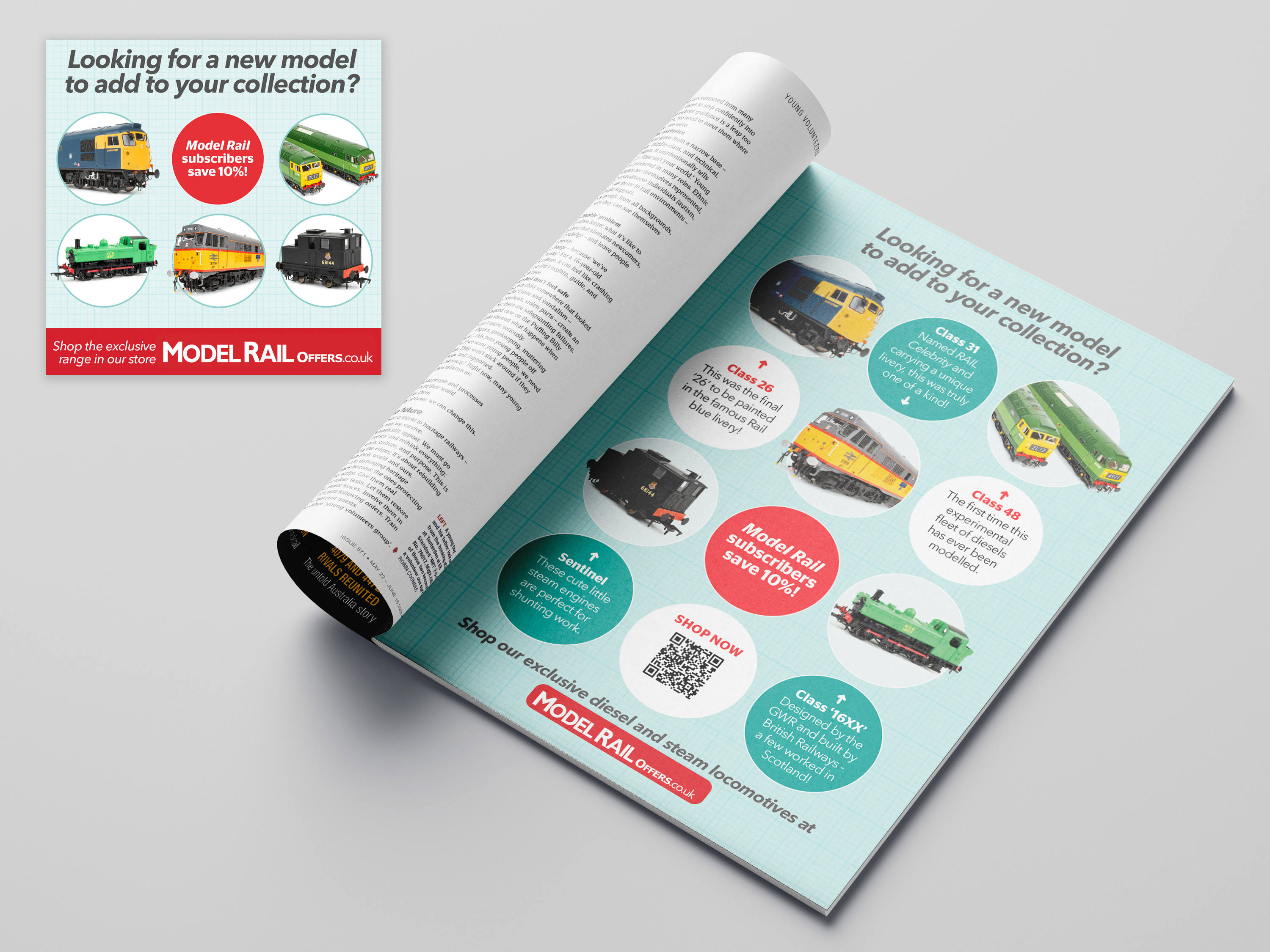
This advert was part of a multi-channel campaign promoting Model Rail’s exclusive range of limited-edition models. The layout uses a clean grid background to reference technical drawings, appealing to the precision of model railway enthusiasts.
Circular frames showcase each locomotive clearly, while bold accent colours highlight key messages such as exclusivity and subscriber savings. The design needed to work across print and digital formats, maintaining clarity and visual impact in every context.
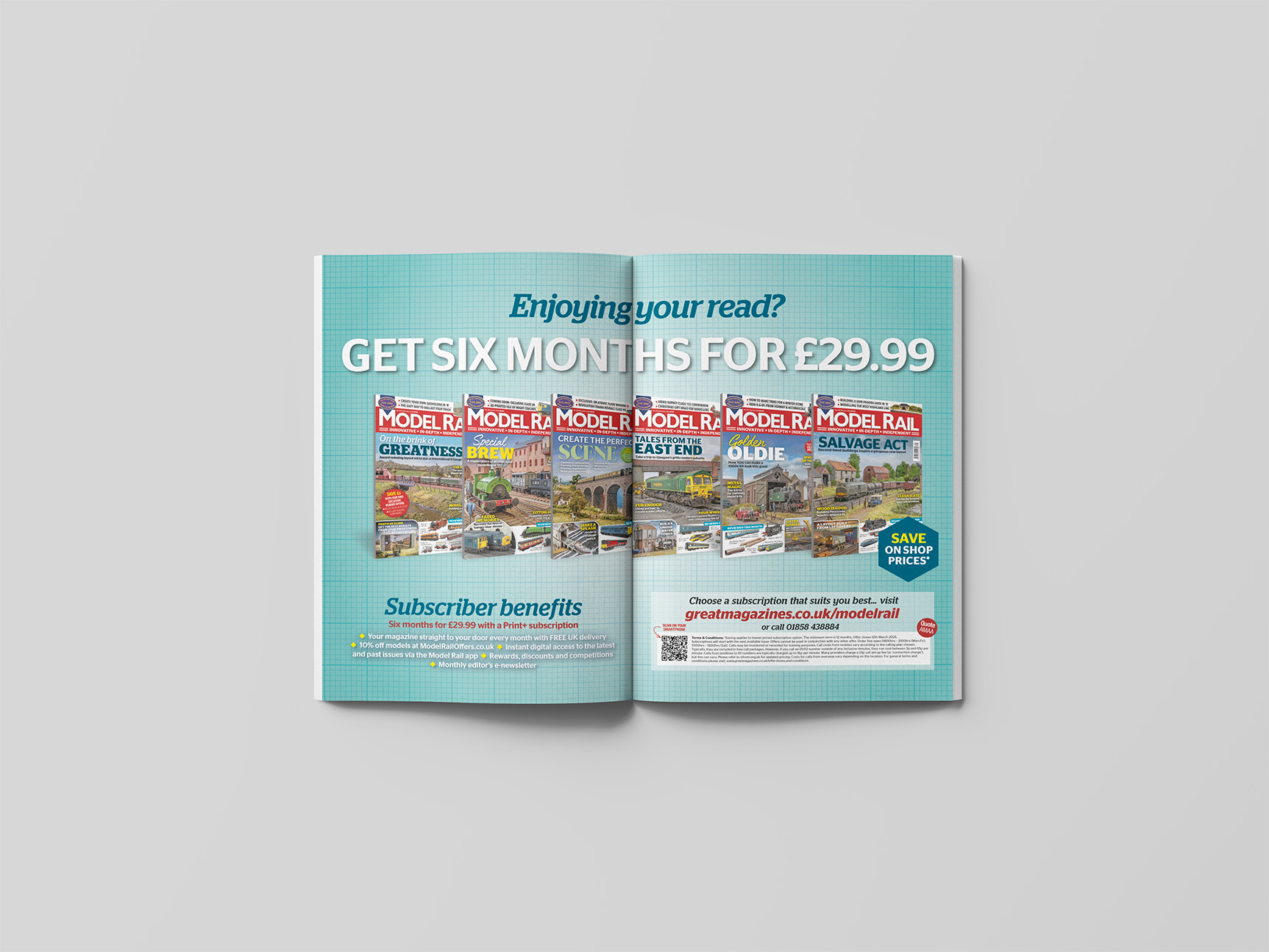
This print ad was part of a broader subscriber campaign designed to boost conversions through clear, benefit-led messaging. The layout uses the same technical grid backdrop as the wider campaign to maintain visual consistency and appeal to the hobbyist audience.
Bold, high-contrast type ensures instant clarity on the core offer, while magazine covers provide visual proof of value. Supporting benefits are clearly listed to reinforce the subscription’s appeal and drive response both in print and online.Rail style.
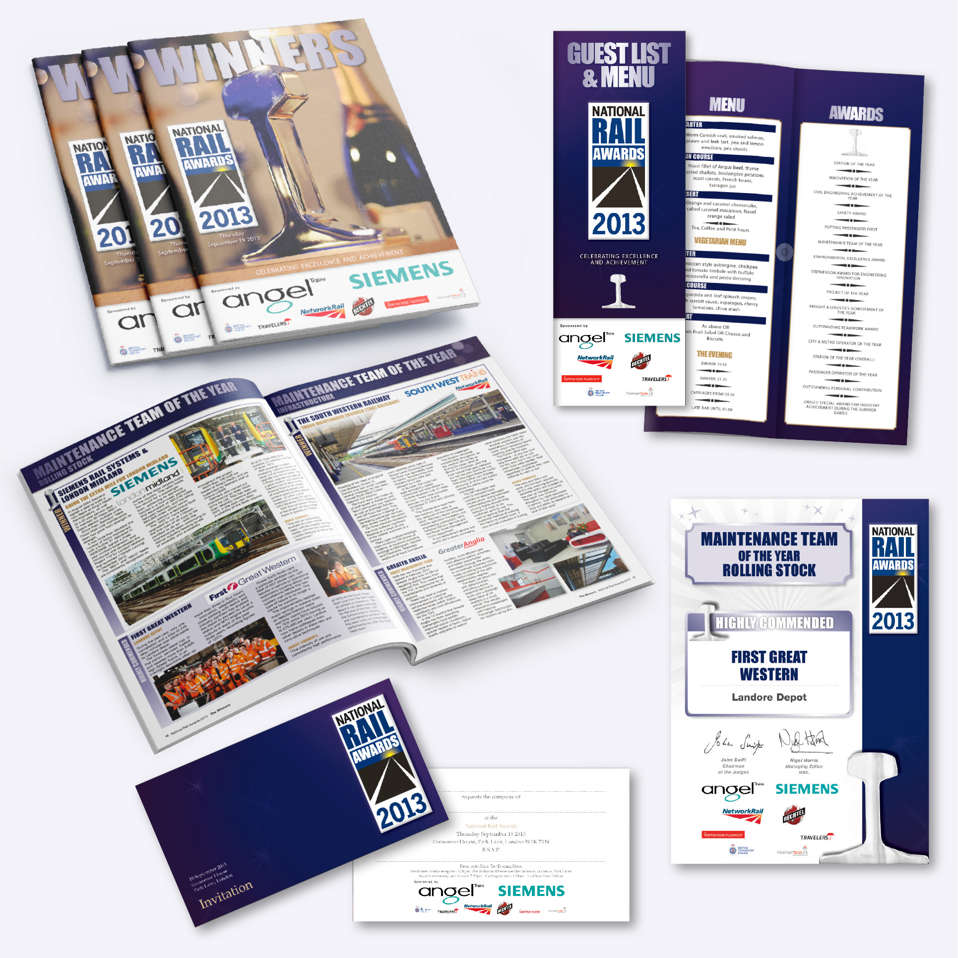
For the National Rail Awards – Britain’s largest and most respected rail awards ceremony – I was responsible for creating and maintaining a consistent, high-impact visual style across all event assets. This included everything from invitations, brochures, menus, guest lists, roll banners, and certificates, ensuring a unified and prestigious brand presence.
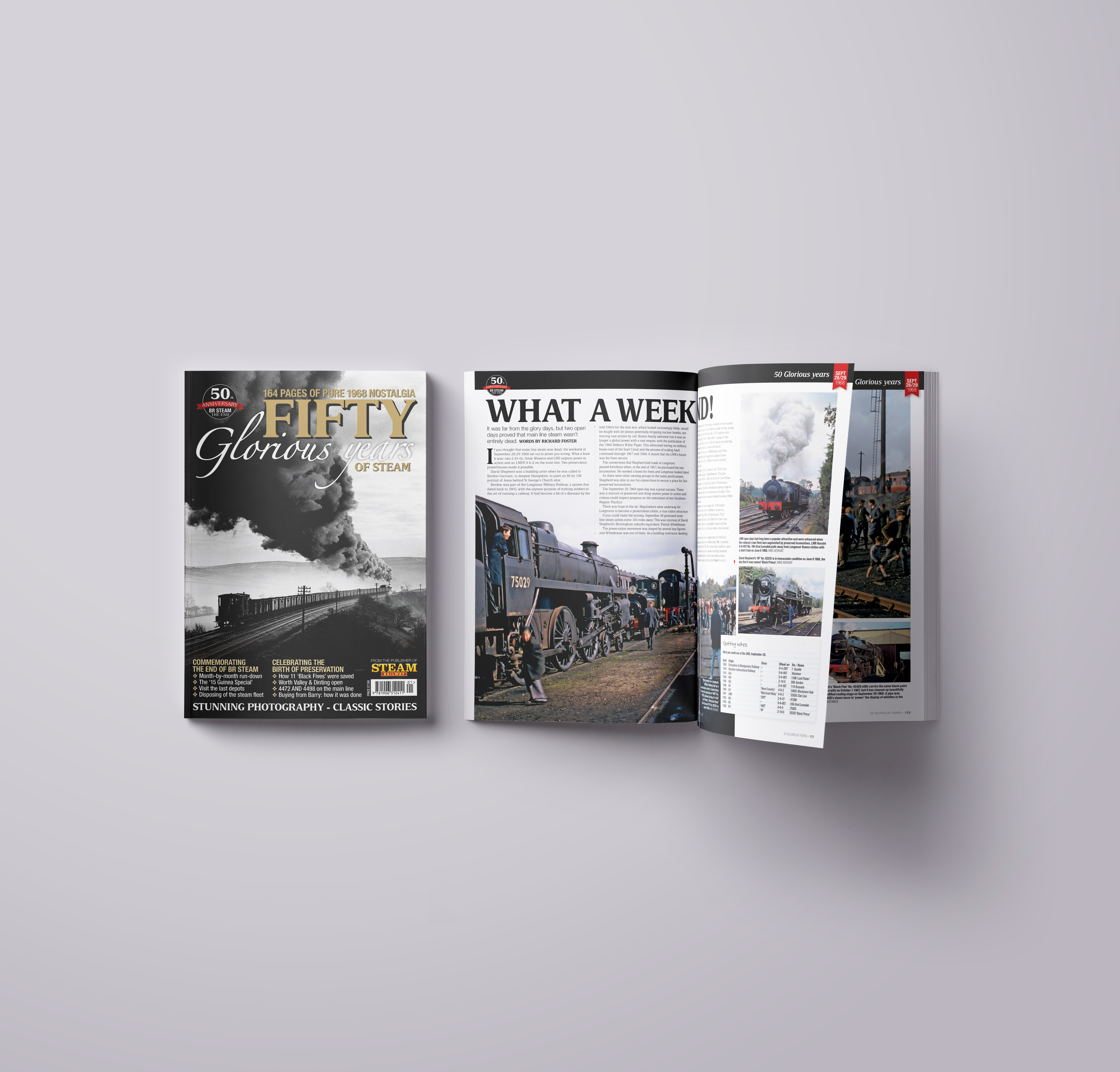
For a standalone book celebrating 50 years of Railway preservation, I led the creative direction. My role encompassed everything from logo creation and template development to designing all 164 pages, defining the entire look and feel.
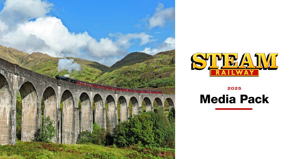


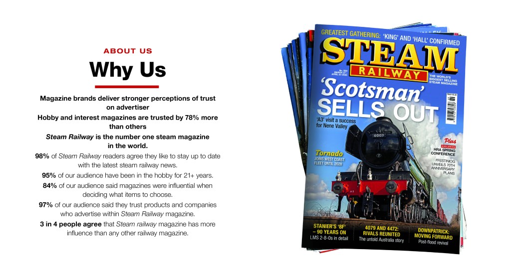
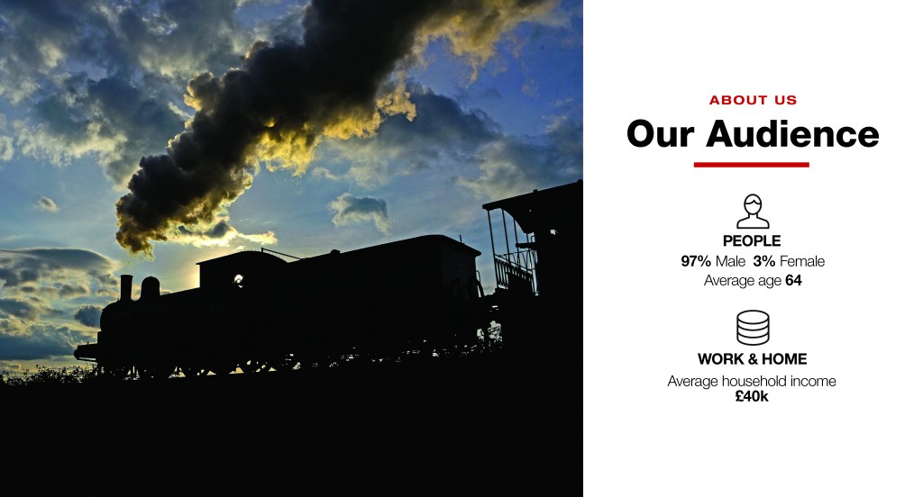

This project involved creating a visually compelling and informative resource for the advertising sales team, effectively communicating the magazine’s unique audience and advertising opportunities to prospective clients. The design ensured brand consistency and maximized the persuasive power of the content to drive advertising revenue.
